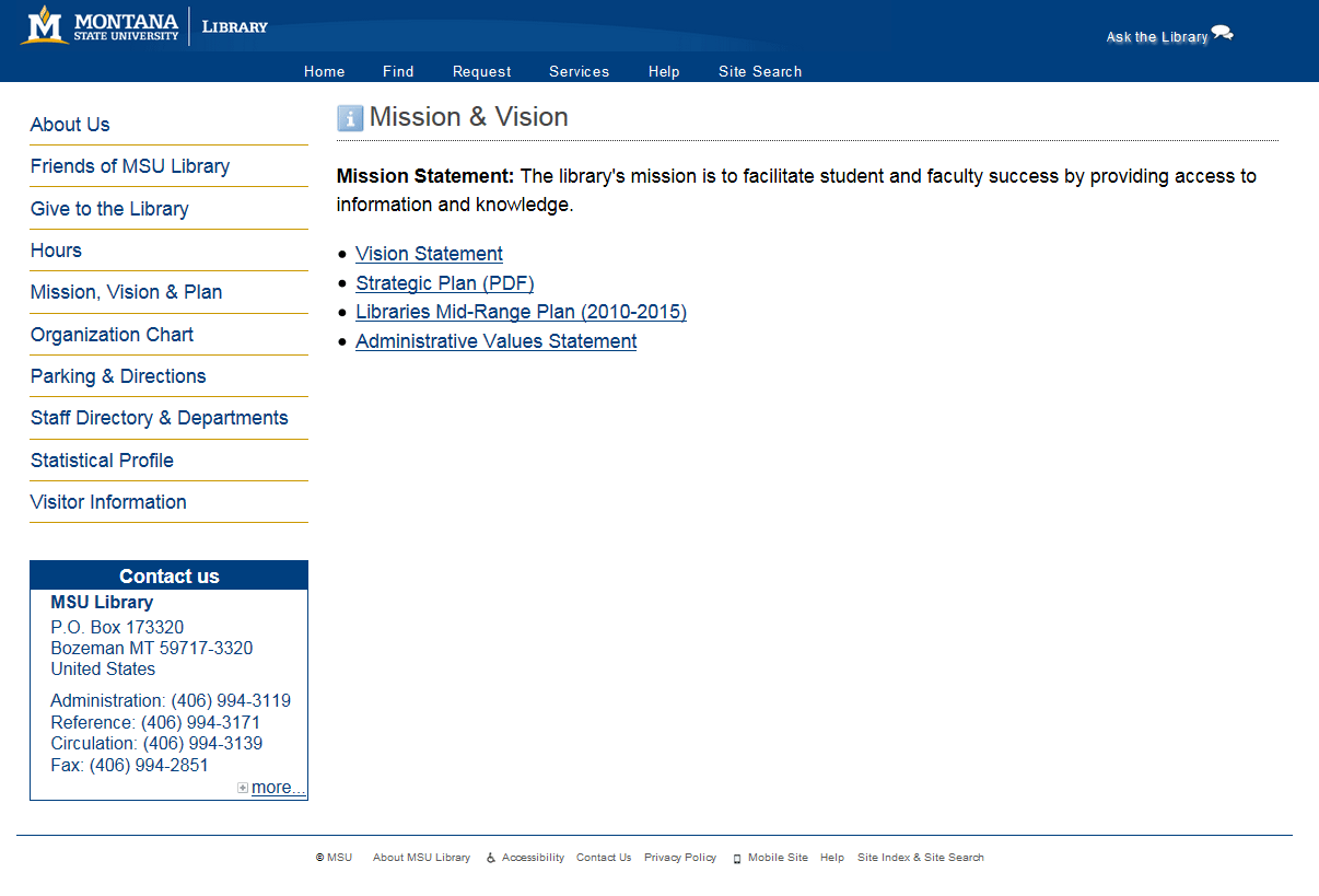
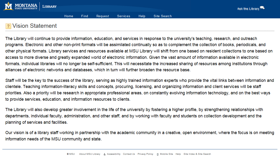
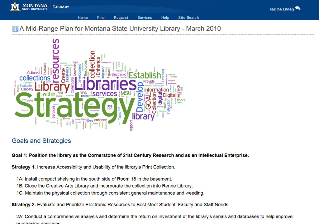
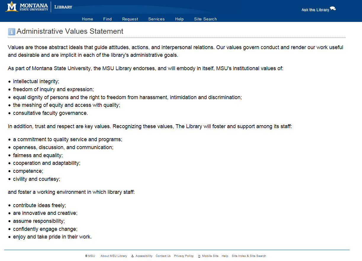
Over the last several months we’ve been developing a new Information Architecture map for our library webpages. Our goals for this project involve an overall simplification of structure and navigation, which calls for a reduction in pages and links throughout the site. Today we initiated the first of these organizational changes to our Mission/Vision pages. Previously this content included 4 subpages with a primary landing page.
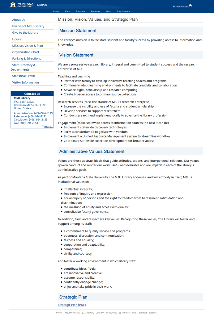
The internal navigation of these pages was inconsistent with other pages throughout the site, and maintaining individual subpages created bloat for us and friction for users. To alleviate these issues, this content has now been combined into a new single Mission/Vision page, seen below. The outdated Mid-Range Plan has also been removed, further adding to the streamlined experience of this content. This approach fundamentally trades clicking for scrolling—fewer pages and links throughout the site with longer pages overall. We’ll continue to monitor and evaluate this page as an early test of our new Information Architecture vision.
Pingback: A New Library Website Header — Scott W. H. Young