Slimmer, simpler, faster: A new header for the Montana State University Library website.
A few months ago I wrote a post about streamlining multi-page content into a single page. This design decision encourages the user to scroll through longer single pages rather than click through multiple pages. As our pages have become longer as a result, more content started to move farther away from the header, which contains our branding, global navigation menu, and the “Ask A Librarian” link. Our header contains this important information both for us and for the user, so we set out to design a new header to fit our longer pages.
With this impetus to design a new header, we aimed for a few overall improvements:
- Fixed position
- Responsive
- Semantic
- Slimmer
- Simpler
- Faster
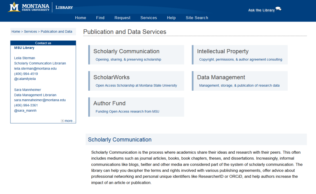
Our existing header has been around since 2011—pretty good really! And definitely time for an upgrade. Here’s a screenshot and the HTML markup for our existing header:

<div id="mastHead">
<img src="/meta/img/libraries.png" alt="Montana State University in Bozeman" usemap="#Map" title="Montana State University in Bozeman"/>
<map name="Map" id="Map">
	<area shape="rect" coords="0,0,188,60" href="http://www.montana.edu/" alt="Montana State University - Home" />
	<area shape="rect" coords="0,0,320,60" href="http://www.lib.montana.edu/" alt="Montana State University Library - Home" />
</map>
<div id="ask">
    <a style="color: #fff;" href="/ask/">Ask the Library<img src="/meta/img/chat_icon.png" alt="ask the library" title="ask the library" style="width: 30px; height: 22px" /></a>
</div><!--end ask-->
</div><!--end mastHead-->
<ul id="globalNav">
	<li><a class="home" href="/" title="link to library home">Home</a><img width=0 itemprop="logo" src="/meta/img/montana-state-university-library.png" /></li>
	<li><a class="find" href="/find/" title="link to find">Find</a></li>
	<li><a class="request" href="/request/" title="link to request">Request</a></li>
	<li><a class="interact" href="/services/" title="link to services">Services</a></li>
	<li><a class="help" href="/help/" title="link to help">Help</a></li>
	<li><a class="site" href="/search" onclick="return toggleSearchForm()" title="link to site search">Site Search</a></li>
    <li id="searchForm" style="visibility:hidden;">
    <form id="searchSite" action="/search/index.php" method="get">
    <fieldset>
    <input type="text" id="searchField" name="q" maxlength="200" size="35" />
    </fieldset>
    </form>
    </li>
</ul> <!-- end globalNav list -->
In keeping an iterative process in mind, our new header takes subtle steps forward while helping us realize a better website overall, one that’s lighter, faster, and more responsive.

MSU Library Website Header, 2011-2014
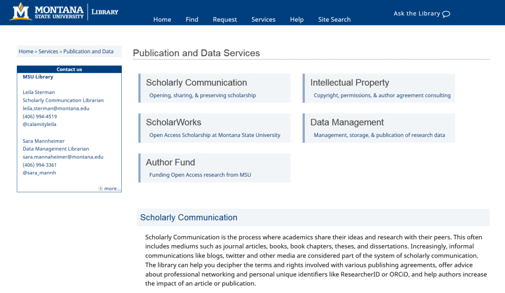
MSU Library Website Header, Late 2014
The new header achieves some key things:
- sticks to the top of the screen as the user scrolls through longer page content
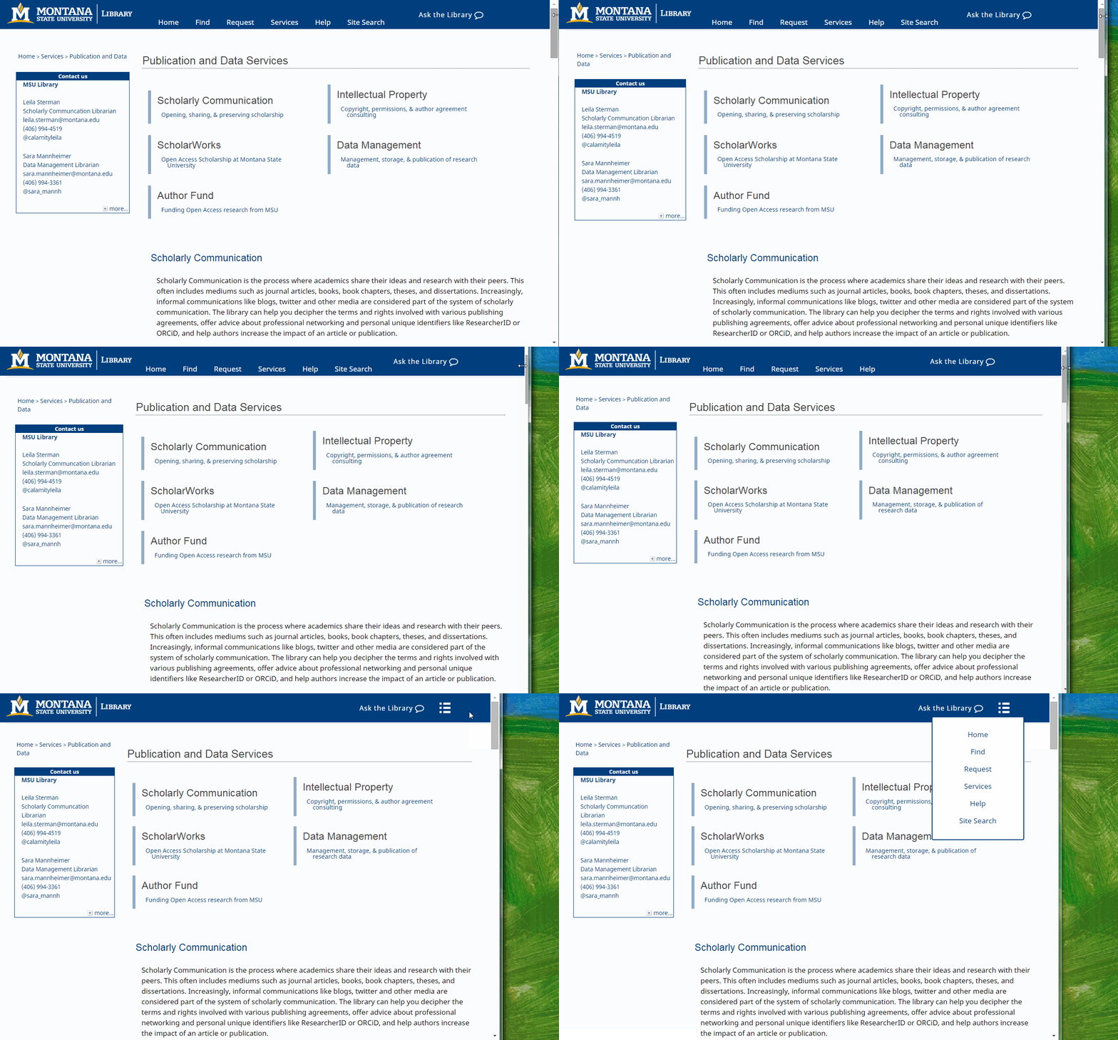
- responds to browser width and device size
- has fewer HTTP calls, resulting in faster overall page load time and performance
- includes a new icon font instead of an icon image, also benefiting performance (though icon fonts may not be as beneficial as SVG icons)
- features semantic HTML5 tags
- is 15% slimmer than the previous header
- uses 32% fewer lines of HTML
Here’s a screenshot of the new header, an animated gif showing its responsiveness, and the HTML and CSS code behind it:


<header>
 <a href="http://www.montana.edu" id="logo"></a>
 <nav>
  <a href="#" id="menu-icon"></a>
  <ul>
	<li><a class="header" href="/" title="link to library home">Home</a></li>
	<li><a class="header" href="/find/" title="link to find">Find</a></li>
	<li><a class="header" href="/request/" title="link to request">Request</a></li>
	<li><a class="header" href="/services/" title="link to services">Services</a></li>
	<li><a class="header" href="/help/" title="link to help">Help</a></li>
	<li><a class="header site" href="/search/index.php">Site Search </a></li>
  </ul>
 </nav>
 <div id="ask">
 	<a href="/ask/">Ask the Library<i class="fa fa-comment-o fa-lg"></i></a>
 </div>
</header>
header {
	background: #003f7f;
	width: 100%;
	height: 70px;
	position: fixed;
	top: 0;
	left: 0;
	border-bottom: 4px solid #eaeff4;
	z-index: 100;
}

header #logo {
	margin: .5% 0 .5% 2%;
	float: left;
	width: 300px;
	height: 50px;
	background: url(/meta/img/msu-library-header.png) no-repeat center;
	background-size: 300px 50px;
	display: block;
	z-index: 101;
}

header nav {
	width: 600px;
	margin: 0 auto;
	padding: 20px;
}

#menu-icon {
	display: hidden;
	width: 40px;
	height: 40px;
	background: #003f7f url(/meta/img/menu-icon.png) center;
}

header ul {
	list-style: none;
	font-family: 'Noto Sans';
	font-size: 1.2em;
	position: relative;
	bottom: 5px;
}

header li {
	display: inline-block;
	float: left;
	padding: 12px;
}

a.header {
	color: white;
	font-size: 1.1em;
	line-height: 1.25em;
}

a.header:hover {
	color: #f0f0f0;
	text-decoration: none;
}

header a:hover#menu-icon {
	background-color: #054b8c;
}

#ask {
	text-shadow:none;
	font-size: 16px;
	width:auto;
	top:5px;
	float: right;
	font-family: 'Noto Sans';
	margin-top: 20px;
}

#ask a:hover {
	border-bottom: 1px dashed white;
	text-decoration: none;
}

@media only screen and (max-width : 1220px) {

	header #menu-icon {
		display:inline-block;
		float:right;
		margin-top: -5px;
	}

	header nav {
		width:80%;
	}

	a.header {
		color: #003f7f;
	}

	a.header:hover {
		color: #003f7f;
		text-decoration: none;
		border-bottom: 1px dashed #003f7f;
	}

	header nav ul, header nav:active ul {
		display: none;
		position: absolute;
		padding: 20px;
		background: #fff;
		border: 2px solid #003f7f;
		right: 60px;
		top: 40px;
		width: 15%;
 height:250px;
		border-radius: 4px 0 4px 4px;
	}

	header nav li {
		text-align: center;
		width: 100%;
		padding: 10px 0;
		margin: 0;
	}

	header nav:hover ul {
		display: block;
	}
}
We’re currently testing the header on a few notably longer pages before rolling it out site-wide. One question we will keep in mind as we continue to monitor and evaluate the header is the so-called hamburger icon, which some have said is not the best option for indicating a menu.
With the idea of perpetual beta in mind, this new header represents an ever-so-slight progression that enhances the experience of our users.