The zeitgeist of today’s web culture runs something like this: “Social media is more popular than ever, therefore social media buttons should be in more places than ever.” Pew Internet, among others, continually confirms the growing tide of social media usage. As a result social media is now ever-present on the web, and the corresponding ubiquity of social media buttons has generated a fair share of skeptical responses. Oliver Reichenstein, founder of design agency iA, wrote back in May 2012 that we should all “sweep the sleaze” and rid ourselves of social media buttons. Reichenstein criticizes these buttons as unnecessary and unwelcome, saying that social media buttons are in effect desperate pleas to share. He might be right about that. But he predicted that the buttons “will vanish for sure.” So far, he’s definitely wrong about that.
Social media buttons are now more prevalent than ever. Websites from major brands to minor bloggers include social media buttons almost as a matter of course. Why is that? Luke Wroblewski recently posed a critical question regarding social media buttons: what are the click-through rates?

It turns out that the British government was willing to share some data. In fact, Luke W.’s question was motivated by an extensive report released by GOV.UK detailing the performance of social sharing buttons across the GOV.UK website. The summation of this report:
“During the time period we analysed, GOV.UK URLs were shared a total of 14,078 times to Facebook and Twitter using our sharing buttons – that’s 0.2% of the total of 6.8 million pageviews.”
GOV.UK has approached this question with the implicit assumption that the click-through performance of social media buttons is the primary measure of value. Based on this performance-based value proposition, they conclude:
“From what we’ve seen so far, our users aren’t exactly demonstrating an overwhelming case for us retaining social sharing buttons.”
GOV.UK click-through rates are indeed alarmingly low, and I can understand why they would consider removing these buttons, provided that value is measured by click-through rate.
Let’s look at another example from higher ed. The University of Notre Dame Director of Web Communications Erik Runyon shared the social media button click-through rates across seven sites, including the ND.edu web domain. These numbers aren’t so pretty either.
- Twitter: 0.370%
- Facebook: 0.059%
- LinkedIn: 0.008%
- YouTube: 0.112%
- Flickr: 0.028%
Runyon concludes:
“Let’s be honest, finding you on social media isn’t why most people visit your site. But obviously some people do want to engage further.”
True. Some people do click on social media buttons, though it’s often difficult to locate the dividing line between useful to some and unnecessary to most. So what is an acceptable click-through rate for social media buttons? Is this even the right question to ask?
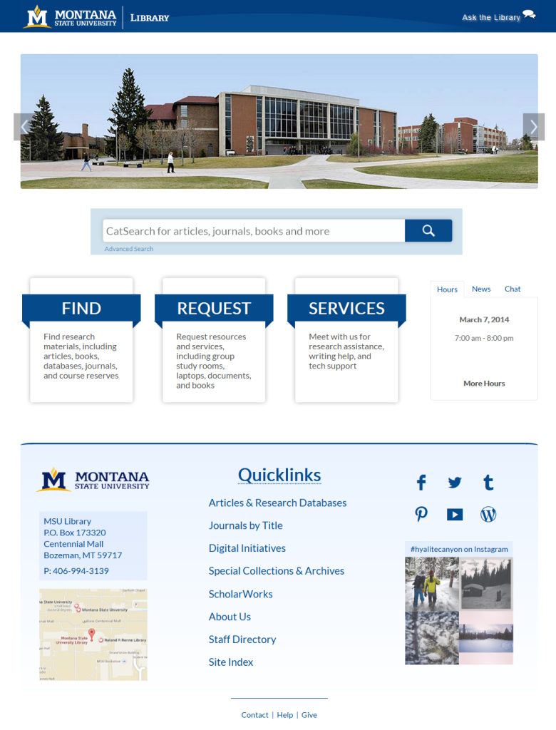
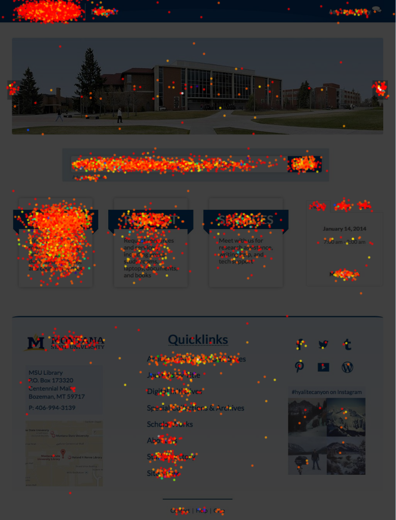
This discussion prompted me to examine the social media button click-through rates of our own library homepage. You’ll notice our social media buttons in the top right of the footer.

Montana State University Library – Homepage

Montana State University Library – Homepage Click Data (sample date range)
Drawing on 4 sample date ranges across this academic year, the click-through rates for the MSU Library Homepage social media buttons reflect the performance of Notre Dame’s:
- Twitter: 0.053%
- Facebook: 0.043%
- Tumblr: 0.043%
- Pinterest: 0.031%
- YouTube: 0.018%
- WordPress: 0.018%
So our click-through rates are low. What should our response be? GOV.UK mentions that they will benchmark their click-through rates against comparable figures from other sites. Given the similarly low numbers across many sites, this will likely offer only limited insight. GOV.UK also says that they will run A/B testing on the position of buttons. Likewise, click-through rates are already so low that alterations in button placement are unlikely to move the meter significantly.
Instead of shifting the placement of social media buttons, we might benefit from shifting our value perspective to a more fully contextual understanding of our users’ relationship to social media buttons. The social media button discussion so far has centered on the click-through, a useful but limited metric. A more interesting line of investigation might instead center on the pageview, or more specifically, the experience of the pageview. From this point of view we can begin to ask a number of UX questions, “What do our users expect to find on our pages? Do they want to see social media buttons? How do our users feel when they see social media buttons? How are our users’ perceptions of us shaped when they see social media buttons?” By taking a longer view at the experience of library users, we can start to understand the more subtle but complete effects of social media buttons. Users might not be clicking on our social media buttons very often, but could the buttons be serving a purpose in a different way?
This line of questioning expands the analysis far beyond click-throughs. Will a user see a Twitter button on a library webpage and later think of tweeting at the library to ask a reference question? If your library’s Tumblr or Instagram features images from special collections, will a user see those buttons and later scroll through the feeds and decide to visit special collections in person or digital collections online? How can we enable the kinds of social media interactions that bring users into the world of the library? How can we utilize social media to expand the library community? Are social media buttons an effective way to do any of these things?
So, as GOV.UK asks, what’s next? Somewhat surprisingly, GOV.UK does not mention user interviews anywhere in their report. This critical component of UX research, mentioned by several commenters to the GOV.UK post, could offer insight into the nature of social media buttons. The evidence is growing that users don’t click on these buttons, but the effects of social media buttons on user experience are yet to be seen. It will be essential to ask our users why they’re not clicking, what they’re seeing and feeling when they encounter social media buttons, and what behavior might follow the page view. In the ongoing evaluation of the purpose and value of social media buttons, we will benefit from moving beyond click-throughs and towards higher levels of analysis around the more connected UX that encompasses social media, library websites, and library resources and services.
This is a fascinating piece, and spot on when it comes to the underlying point that interviews must be conducted in order to truly understand what value (any) element has on a page.
I would love to learn if there’s been any follow-up research done?
Also, I think it will be important to this study to do two things:
1. Make it clear that the subject is “Social Follow” buttons and not “Social Sharing” buttons, as those have very different functions and purposes.
2. Differentiate between different industries/categories, as I believe we’ll find that the impact and usage of social media will vary across the board.
Thank you!
Mike
After reviewing the social share button metrics on 12 major “news” or e-zine websites, your data underscores what we’re seeing. The only sharing numbers we identified that exceeded 1% were top media storylines and stories related to entertainment figures (music / film / tv). In virtually every instance of exceeding 1%, there was ample buzz on television that coincided with the increased share traffic. We’re confident that if users could be tracked, you would notice an extreme minority who comprise a “share” community. We have even attended a “social sharing” consultant seminar where the “expert” said explicitly, “we seed your shares using overseas call-center companies who have added buzz-building to their product offering.” Thanks very much for the article. Terrific to see people looking beyond the hype.