Web forms. Ahhh, sweet lovable web forms. So many websites have forms, and there are so many ways to make forms. For a long time, the forms on our own MSU Library website were good—but not great. So recently we went through an extended overhaul of our forms. In this post I’ll highlight one of our web forms, and I’ll walk through some of the challenges we faced in designing a user-centered form.
Let’s start with a little background on web forms and the user experience. In 2008 Luke Wroblewski published a fundamental text for web form design, Filling in the Blanks. Luke outlines the practices and principles of form design that can generate a positive user experience: simplicity and clarity. The form itself should be simple, and any errors should be clearly communicated. This line of thinking reflects user-centrality. It feels bad when a form is difficult to navigate or outright fails, because that difficulty and failure reflects back on the human user, and we feel that we have failed too. As user experience designers working with the web, we don’t want our forms to make our users feel bad.
More recently, the UX Research team at Google published a blog post arguing for the simplicity of web forms. They note that web forms remain one of the core barriers between users and website owners, and they discuss academic research on improving web form user experience:
Results indicate that improved web forms lead to faster completion times, fewer form submission trials, and fewer eye movements. Data from subjective questionnaires and interviews further show increased user satisfaction. Overall, our findings highlight the importance for web designers to improve their web forms using UX guidelines.
Google researchers outline three primary points of improvement for forms:
- Format specification for form fields (e.g. maximum allowable characters)
- Error handling and notification
- Distinction between optional and required fields
With these points in mind, we set out to rework our web forms for clarity and simplicity, ultimately resulting in a more positive and satisfactory experience for the user.
Here’s what our main contact form looked like before we set about upgrading and refining:
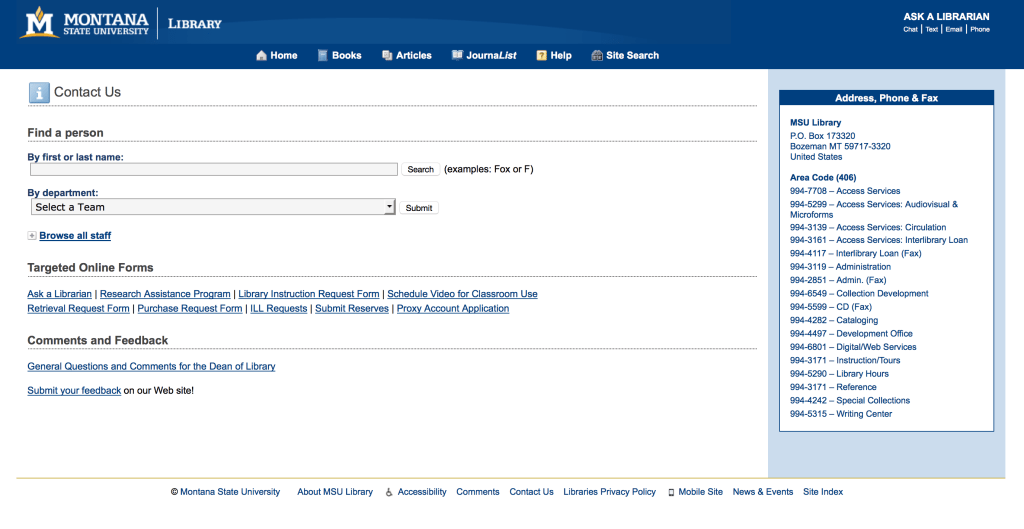
MSU Library Contact Form – 2014
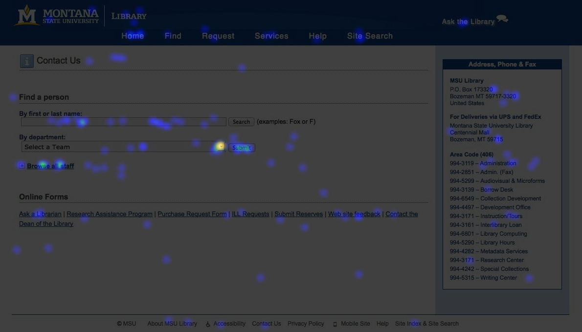
MSU Library Contact Page – 2014, Heatmap
While this page was functional, it suffered somewhat from a lack of focus and purpose. Two central form fields compete with many surrounding links to additional forms. One might not even consider this a contact page, since the page in fact contains no contact form at all, but rather functions more as a entry point into our staff directory, from where the user could contact an individual staff member via email. This additional friction presented an even greater barrier to our users, as they had to first search for a person in the staff directory before being presented with a direct way to contact us. Our first step then was to create clearer and more direct actions for the user. After a design review, the overall page incorporated design language that we’ve been rolling out across the site, including lighter blue color-field backgrounds to mark content areas, box-shadows for text-entry fields, and updated and enlarged web fonts.
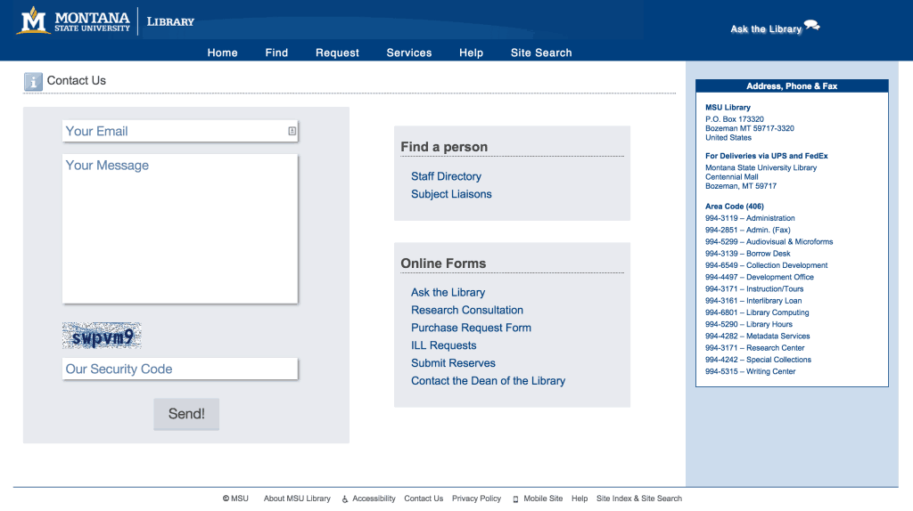
MSU Library Contact Page – 2015
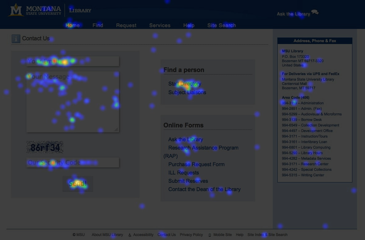
MSU Library Contact Page – 2015, Heatmap
We accomplished a few key things with this new design. The form, first of all, is the central element of the page. It now includes in-line format specification expressed in friendly language, employing second-person pronouns to create a welcoming environment. Additional links to other forms and contact pages are situated along the side with clearly marked headings and groupings. Based on our heatmapping, we can see that many users continue to visit this page as an entry point into the staff directory, while many more are now using the form itself. Based on a 2-month sample of visitors, 54% of users interacted with the form fields on our new contact page.
Beyond the visual design of the page, we also wanted to improve form error handling. Helpfully communicating errors to the user—and reducing errors overall—is an essential aspect of good user experience. At the recent UX Lib conference, Matthew Reidsma gave a talk on building library services for humans, in which he touched on this important issue in UX:

Slide from Matthew Reidsma’s talk, “More Than Usable – Library Services for Humans”
In designing a web form, it’s necessary to design for the breakdown. Users will inevitably make errors in the form—we can’t change that—but we can change how those errors are handled and communicated.
At this point in our form redesign process, we turned to HTML5 to do a lot of the heavy lifting for us. Markup tags specific to forms now allow the browser to issue error messages for required fields, email fields, URL fields, phone number fields, and others. For our simple form, we implemented the following markup to designate our required and email fields:
<input required name="email" type="email" placeholder="Your Email" />
<input required name="comment" placeholder="Your Message" />
With the <required> tag and the <type=”email”>, we can let the browser validate the field for us. So cool.
Before we implemented HTML5 form validation, we kicked users to a separate error page. This action can be jarring by taking the user unexpectedly away from the form.
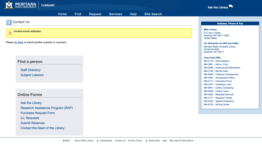
MSU Library Contact Page – Error Message
With HTML5, the error messages are clearer, cleaner, and inline.
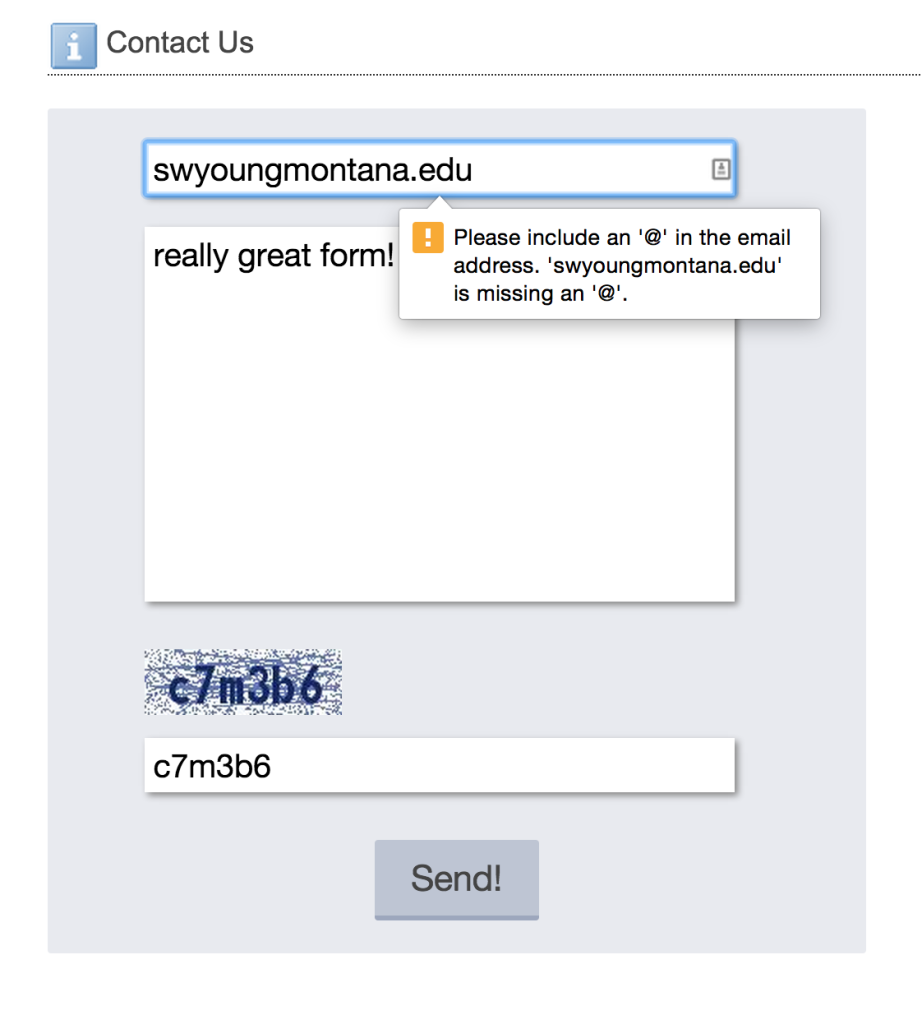
MSU Library Contact Form, with HTML5 <type=”email”>
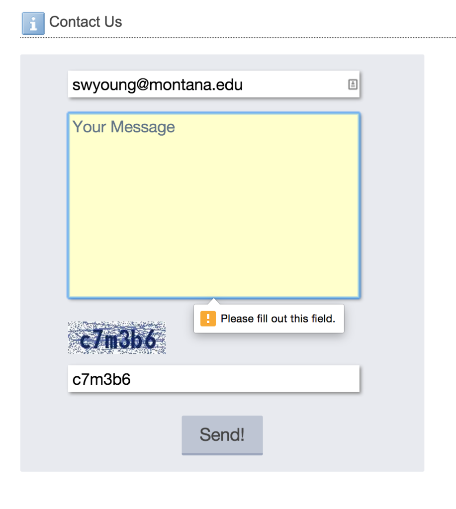
MSU Library Contact Form, with HTML5 <required> tag
For more on building HTML5 forms, check out this HTML5 Web Forms talk from Estelle Weyl.
Okay, now to complete this forms odyssey, we also wanted to ensure that our forms were secure. In February 2014 our library servers were the target of a DDoS botnet attack. Our web forms were found to be vulnerable targets, so we implemented a strict series of security measures to ensure that malicious bots and other spammers wouldn’t be able to overwhelm our systems. Our web forms now all feature honeypots and CAPTCHAs, while we also convert applicable characters into HTML entities and disallow shell command characters. Each layer of security increases our system stability while simultaneously increasing potential obstacles to users. In this way the web form is a representation of the delicate balance to be found between usability and security. CAPTCHAs, for instance, are notoriously difficult for users to complete without error. [Mini CAPTCHA bibliography: design, usability, literature review, user testing blog post]. In addition to honeypots and CAPTCHAs, we also convert form input text into HTML and disallow shell command characters from passing through the form fields. These two measures help ensure that malicious bots and hackers aren’t able to run server commands through our forms. From there, we must create an error handling mechanism that gracefully ensures both the security and usability of the form. Here’s how our initial form design handled an error when the user entered a disallowed character:
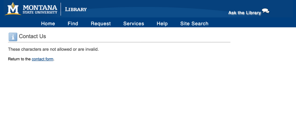
MSU Library Contact Page – Error Message
Not so friendly! This error message falls down three ways: it takes the user away from the form, it doesn’t clearly communicate the error, and it places the onus on the user to correct the error. Without a clear path for recovering from the error, the user is very likely left frustrated and confused. So how do we solve this? Instead of delivering the user to a separate page with a vague error message, we implemented a single line of PHP that replaces the disallowed characters with a benign “*”, thus bypassing any error message at all. Here the code:
$comment = isset($_POST['comment']) ? htmlentities(strip_tags(preg_replace('/[#%&^$\\\\\\/|{}]/', '*', $_POST['comment']))) : null;
Now when a user enters disallowed characters such as this:
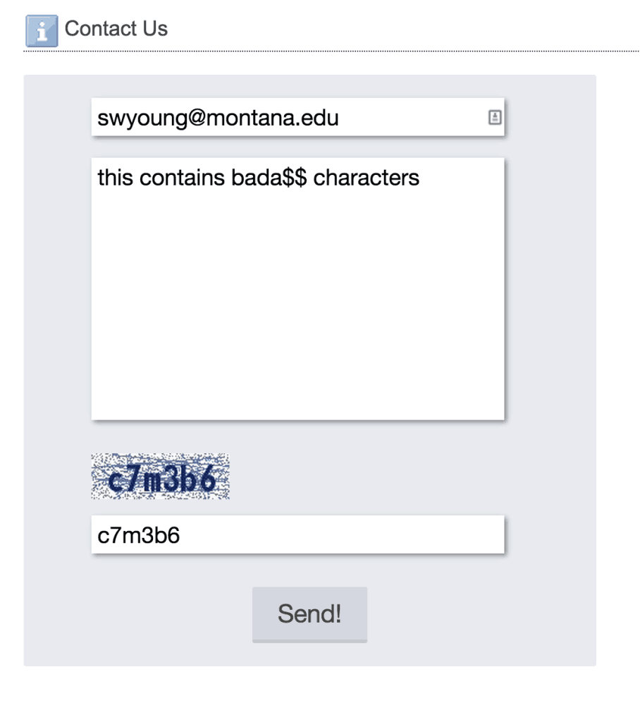
MSU Library Contact Form – Disallowed Characters
The user now sees this:
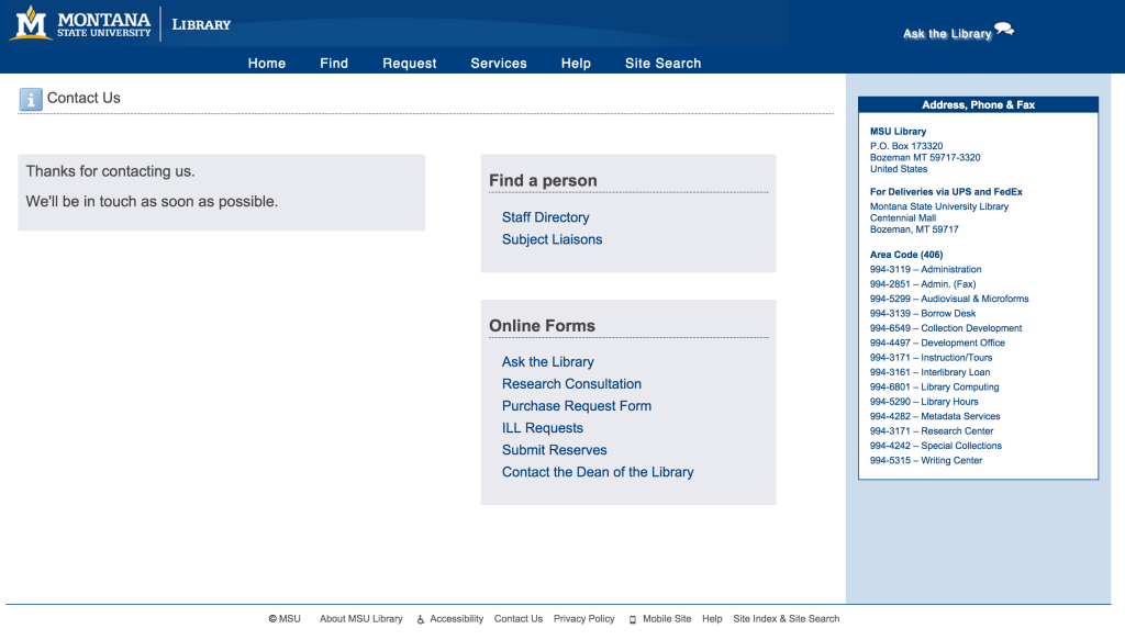
MSU Library Contact Page – Successful Submission
And we see this:
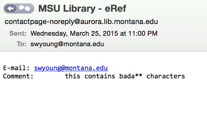
MSU Library Contact Form Message
With this method of error handling, the form remains secure and the user never even knows that there’s been an error. In a way, this design avoids the error entirely. As the user-generated comment is delivered to us, we can still make sense of the message and note any replaced characters. The user only sees what is necessary—the successful submission page.
At this point we’ve improved our contact page in the following ways:
- More focused purpose for the page overall
- Friendlier format specification
- Simpler UI
- Clearer error messaging (or entirely bypassed altogether)
We will continue to monitor this page, comparing overall visits with form submissions and form errors. Ultimately we want to understand user goals and expectations for this page, and design for an experience where those goals can be accomplished quickly and easily.