Google, Google, Google, Google. Google here, Google there, Google everywhere. Okay, maybe not everywhere. But Google holds an undeniable presence in the contemporary information landscape. With that presence comes attention, which in turn has given rise to Search Engine Optimization. Over the last couple of years, our work at the Montana State University Library has concentrated on SEO, with a keen view towards the guidelines set by Google. Now that we’re many months into our SEO initiative, I wanted to take a look back from a UX perspective and compare our Google traffic against another prime focus of attention, our library homepage.
The role and impact of SEO has been a focus of study for some time now. The conversation around SEO is dominated by digital marketers and others with commercial interests, but librarians have been drawn to this discussion after observing Google’s impressive abilities and accomplishments (to the point of near-total domination of search traffic). Our own library dean has published a paper addressing the low indexing rate of institutional repository content in Google Scholar. Others within libraries have explored social traffic for digital collections, SEO for library web content, and the use of Google Analytics for understanding user behavior.
Another recent article on web search traffic really got my attention. Last summer the Scholarly Kitchen took a closer look at their website traffic, finding that sessions from the homepage have remained mostly flat over time, while sessions that did not begin on the homepage have tracked upward alongside an overall increase in sessions.
The Scholarly Kitchen – Web Traffic Analysis
This growing disparity is attributed to the rise of traffic from search and social channels, and it’s used to justify the allocation of resources away from homepage design and development. This is an interesting take, and it may indeed be the right choice for the Scholarly Kitchen. Their analysis certainly serves as another indication that search is important from the perspective of web traffic. But web traffic alone is not the only or best measure of success. It occurred to me that this analysis doesn’t consider that the quality of traffic might also be effected by new channels. Traffic quality could be captured through metrics like average time on page, average session duration, pages per visit, and bounce rate. So while the analysis from the Scholarly Kitchen reflects a high-level view of the changing nature of web traffic and the growing dominance of search in directing users to websites, it could also go further in highlighting not only where users come from, but also how they behave once they arrive and what their experience is when arriving through different channels. In considering the Scholarly Kitchen’s web traffic data, I was also reminded of a tweet from last fall’s LITA forum, in which I made a value proposition that placed the library homepage and search in opposition.

I wanted to push back on this idea by looking closer at these two user segments. With that in mind, I applied a similar—but slightly expanded—analysis to our own library website.
During the 18-month period from October 2013 to March 2015, the percentage of our website sessions originating from Google increased from about 18% to 26%, and the percentage of sessions beginning from the homepage decreased from 68% to 57%. The overall trend is clear: search is up, homepage is down.

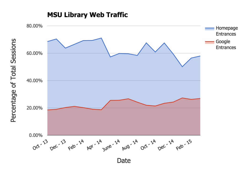
The number of sessions overall has remained mostly constant during this time period, and reflect the academic year rhythm of summer lows and mid-semester highs. Change has not come in the form of increasing or decreasing users overall, but in where those users arrive from. So as our traffic sources have shifted from the homepage to search, has there been a corresponding shift in traffic quality? To begin answering that question, we can look at a few key metrics available through Google Analytics.
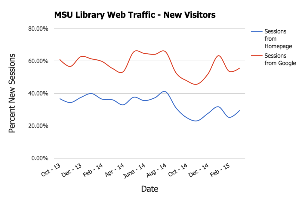
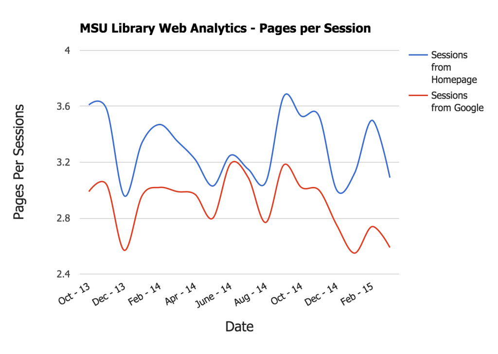
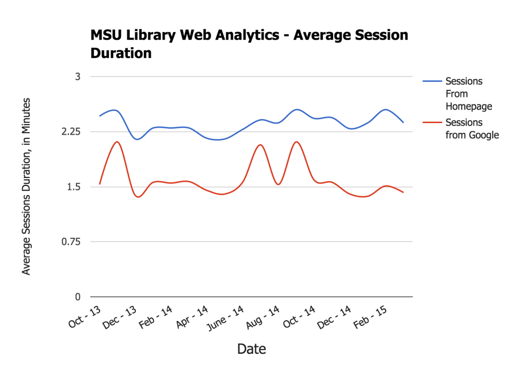
From this data we can see that users who come to the site through Google tend to be new visitors who spend less time on the site and view fewer pages. Perhaps these users coming to our site from Google are able to find the exact page or pages that they’ve searched for, and are thus spending less time on the site getting there. In contrast, users from the homepage are spending more time on more pages, and are about 50% more likely to be returning visitors. How can we interpret this data? When viewed in isolation, web analytics can be perplexing. For this reason it’s essential to evaluate web analytics from within a wider context of user experience research. Traffic data serves as a clue to user behavior, but we can’t see the full picture through web analytics alone. For a clearer view of user behavior, I’ll combine the quantitative data generated through Google Analytics with qualitative data generated through user interviews, observation, and ethnographic research. UX and SEO are complementary aspects of building user-centered websites, and can be productively pursued in tandem (for more on UX+SEO, check out this interview with information architect Marianne Sweeny). As a next step for this project, I’ll interact directly with users who navigate to our site through the homepage, and others who find us through search.
Until then, I can be sure that more and more users are indeed finding us through Google. I can also be sure that while fewer and fewer users enter our site through the homepage, that segment of our user population is still significant and worthy of attention. What these different types of users are trying to do, what contexts they’re working within, how they accomplish their tasks, and how they feel along the way will be questions to ask for future UX research sessions.